
KNF Worldwide
Corporate Website Relaunch 2020
KNF is the technology leader in the sector of application-specific pumps and pump systems. The challenge for the new corporate website at Mutabor was to create a state-of-the-art visual design and to simplify editorial maintenance. The focus was on presenting a complicated product in a way that was appropriate and an intuitive experience. It is available in 16 localized versions and 10 languages and becomes an expression of the company's statement: One KNF.
In addition to supporting conceptual and design work, my main task was the company site with the About section.

KNF goes Lottie
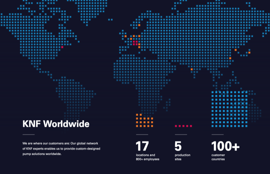
One KNF was exactly what they wanted to show in animated form in their company section. Therefore I created an integrated graphic as a world map, which shows the network and all locations of the company in an animated style. I developed an animation that is not deployed as a video or gif, but instead is integrated entirely web-based using Lottie. The pros definitely were that the animation looks razor-sharp no matter what device it's playing on, and that the file size is very low. Furthermore, the integrated text is still recognized as text and can be marked and copied, for example. The many pixels of the map nevertheless caused some performance issues, which is why we had to execute quite a few tests to find a suitable way for the implementation. (Hint: the pixels are no longer part of the animation ;) )
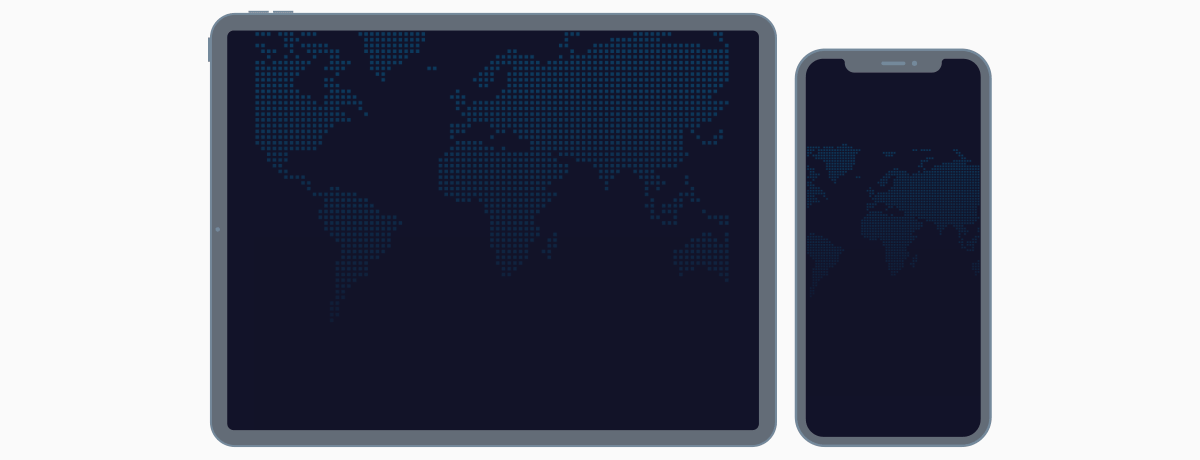

Responsive in various languages
Another huge advantage of using Lottie was that we were able to add css-classes to the Lottie json, which is why we were able to access, for example, Asian characters without the need for the correct font in the design. The font style can be addressed via the web fonts and CSS integrated into the page.
My Role (map): concept, design, animation, implementation
Client: KNF
Agency: MUTABOR
Product Designer: Christian Schulze
Client: KNF
Agency: MUTABOR
Product Designer: Christian Schulze
Categories:
UI, UX, Animation, Lottiefiles
UI, UX, Animation, Lottiefiles