36 Days of Type
Through the Years
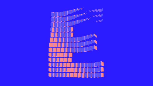
≫ 36 Days of Type is a project that invites Designers, Illustrators and Graphic Artists to express their particular view on letters and numbers of our alphabet. 36 days of restless creativity, where participants are challenged to design a letter or number each day, resulting an outcome of the ability to represent the same symbol from many different perspectives. A project that aims to be a space for creation around typography and its endless graphic possibilities.≪
I have participated in the contest each year since 2017 so far and have finished four out of five with a full set. Please find all creations on my Instagram Channel. In the following you will find a selection of my favorite creations as well as a review of the last five years.
2017 — the takeoff
To challenge myself and develop rapidly in design and animation, I decided to participate at 36 Days for the first time. With surprising success, because three of my designs were featured by 36 Days, which I never expected.
2018 — the imperfect
2018 turned out to be a very busy year, which is why I didn't get the whole set done. Nevertheless, I still managed to get a feature. :D
2019 – the experiment
In 2019 I put my focus on trying new types of animation and also moving a bit more towards a digital style and look.
2020 – the recovery
2020 was all about rebuilding animations that had already been created. That is to say, I transformed some of my previously created animations into letters.
2020 & Mutabor
2020 was also the year I convinced Mutabor to join the challenge as one of the leading design agencies in Germany. With the result that every day a different design was created and published by a different employee. This slightly alternative task, far away from the daily customer service, was very well received by the employees and achieved 10% more followers on Mutabor's Instagram channel.
2021 — it's time for something else
This year I decided to use the challenge to create an animated typeface for After Effects. Such an animated typeface works like a construction kit. All letters and numbers of the font are available as animation and all you have to do is put them together into words. Colors, partial shapes and parts of the animation do not have to be adjusted in the timeline, but can be customized individually, easily and quickly using controllers created from expressions. I will provide the final typeface separately as soon as it is finished.